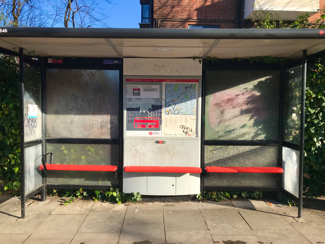
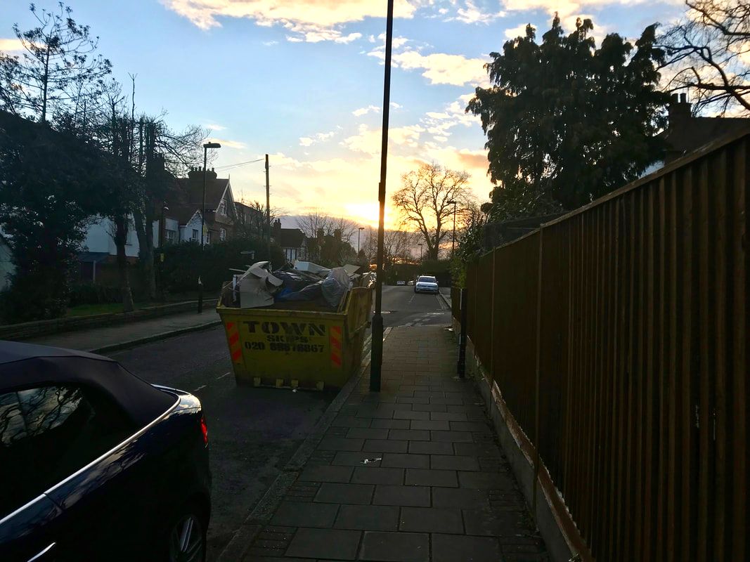
The Good, the Bad and the Ugly
For this section of 'Environment', the link artist is Richard Wentworth. A few of his pictures are uploaded below. The section The Good, The Bad and The Ugly is where photos are taken under different categories and are open to interpretation. The pictures were decided Good, Bad or Ugly by Richard Wentworth.
|
|

|
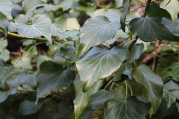
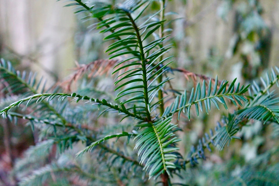
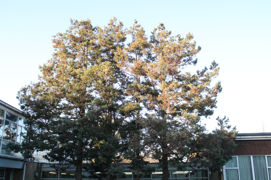
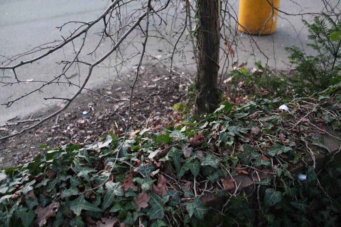
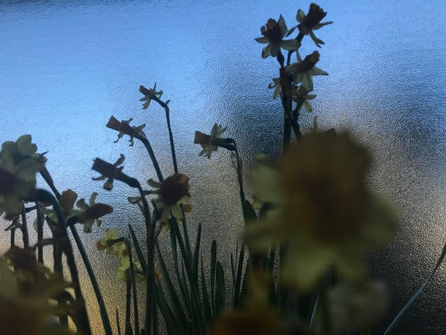
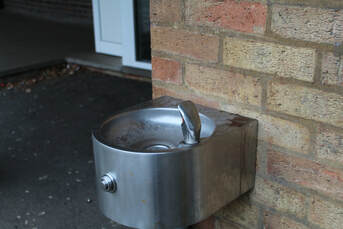
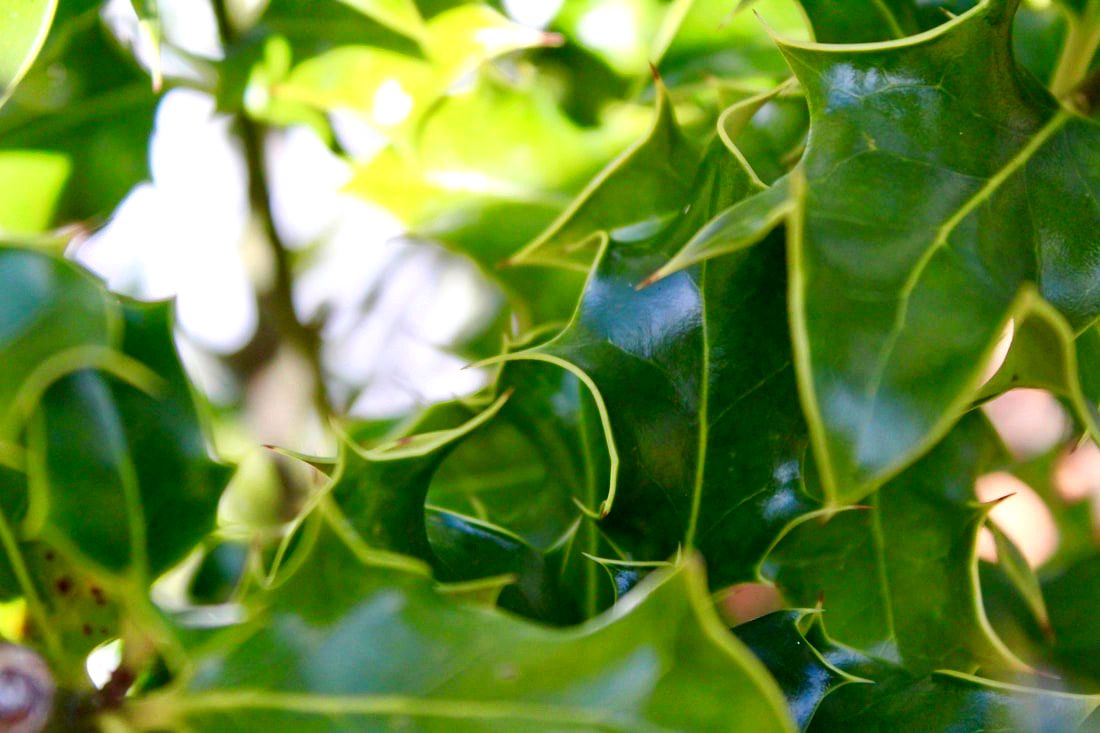
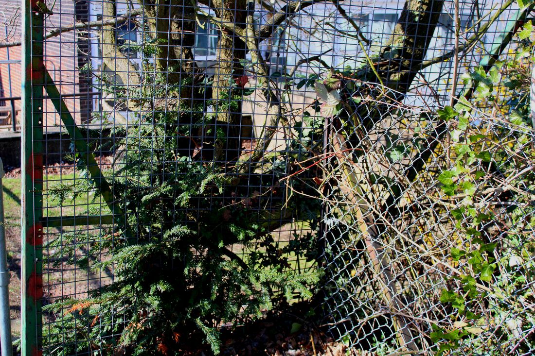
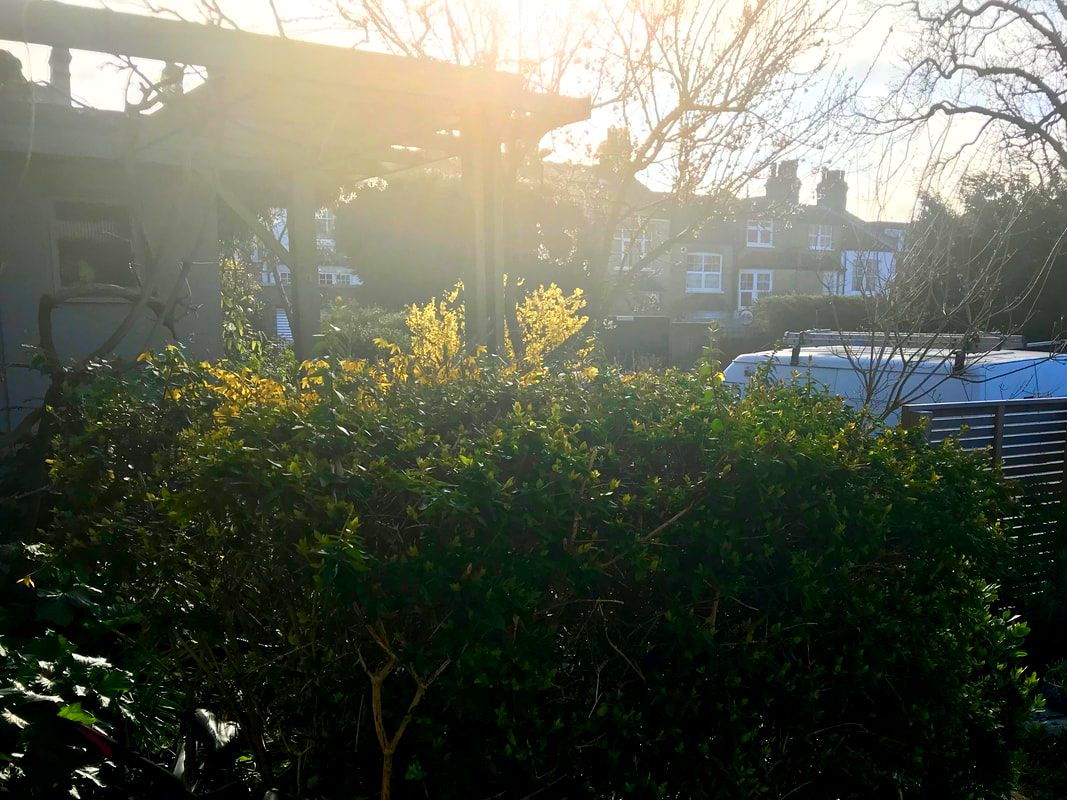
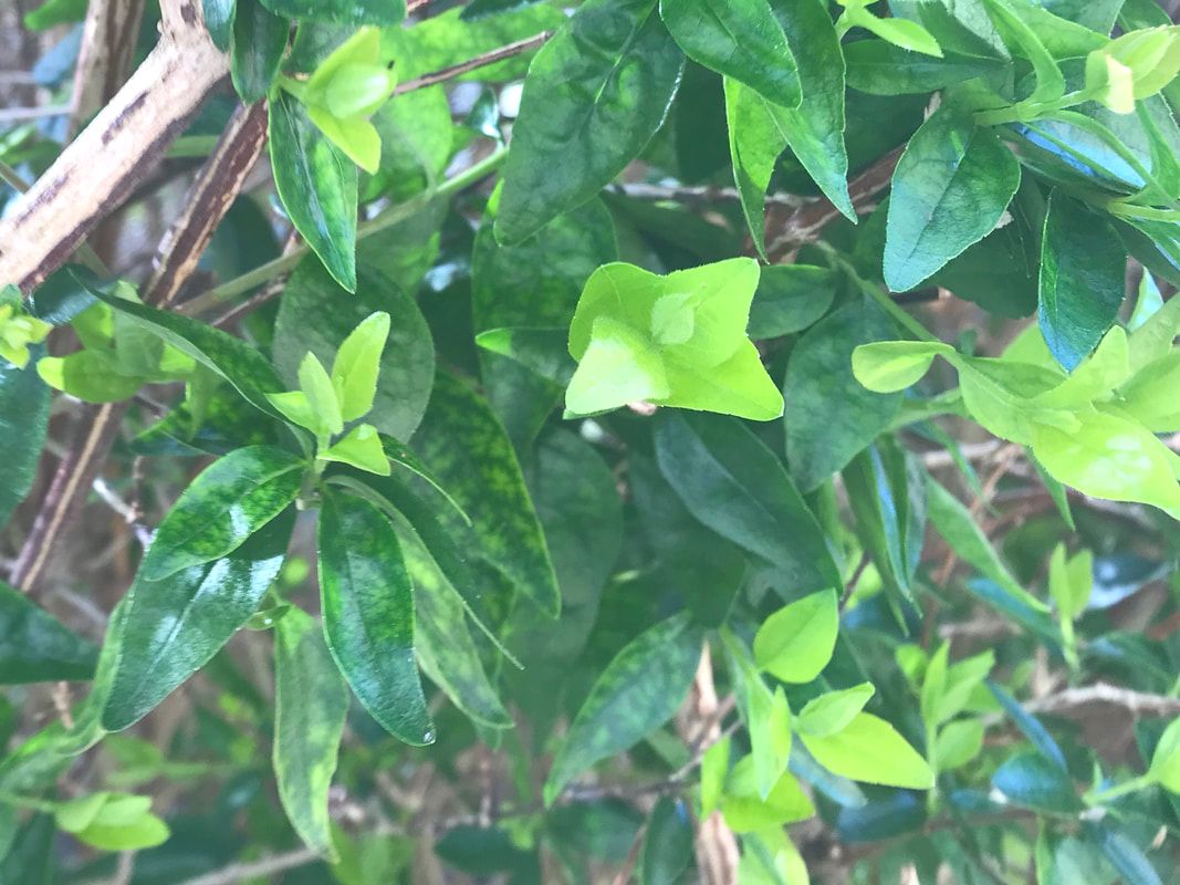
The Good
Here are pictures I've deemed good, for example healthy plants and warm colours.
|
|
|
|
|
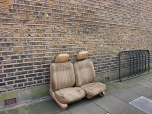
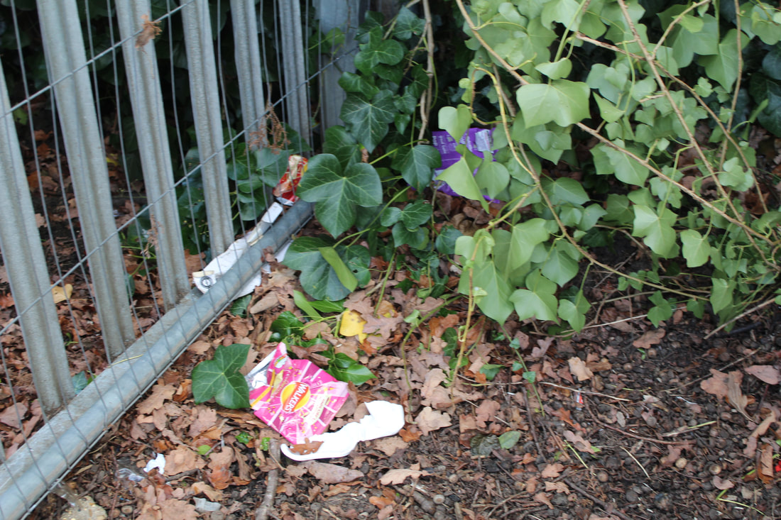
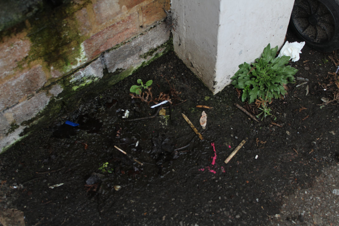
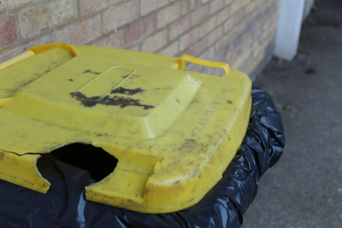
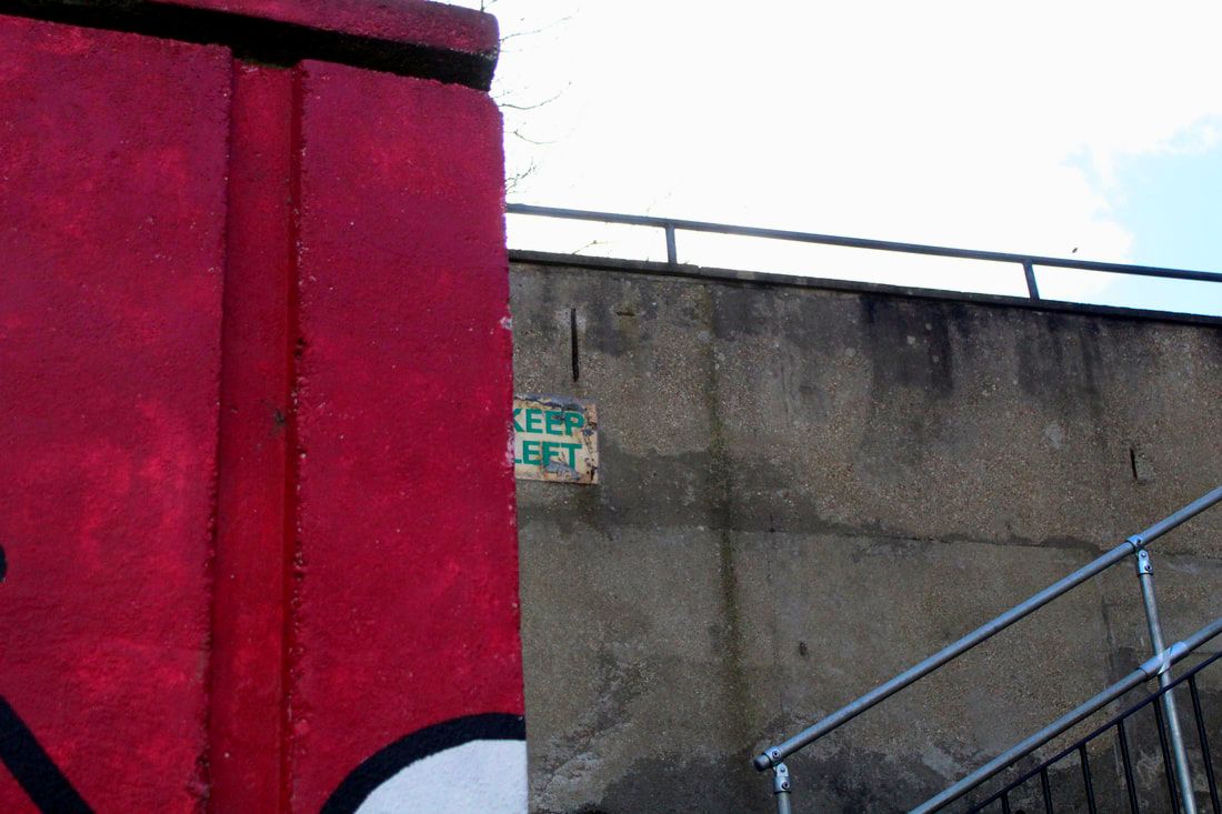
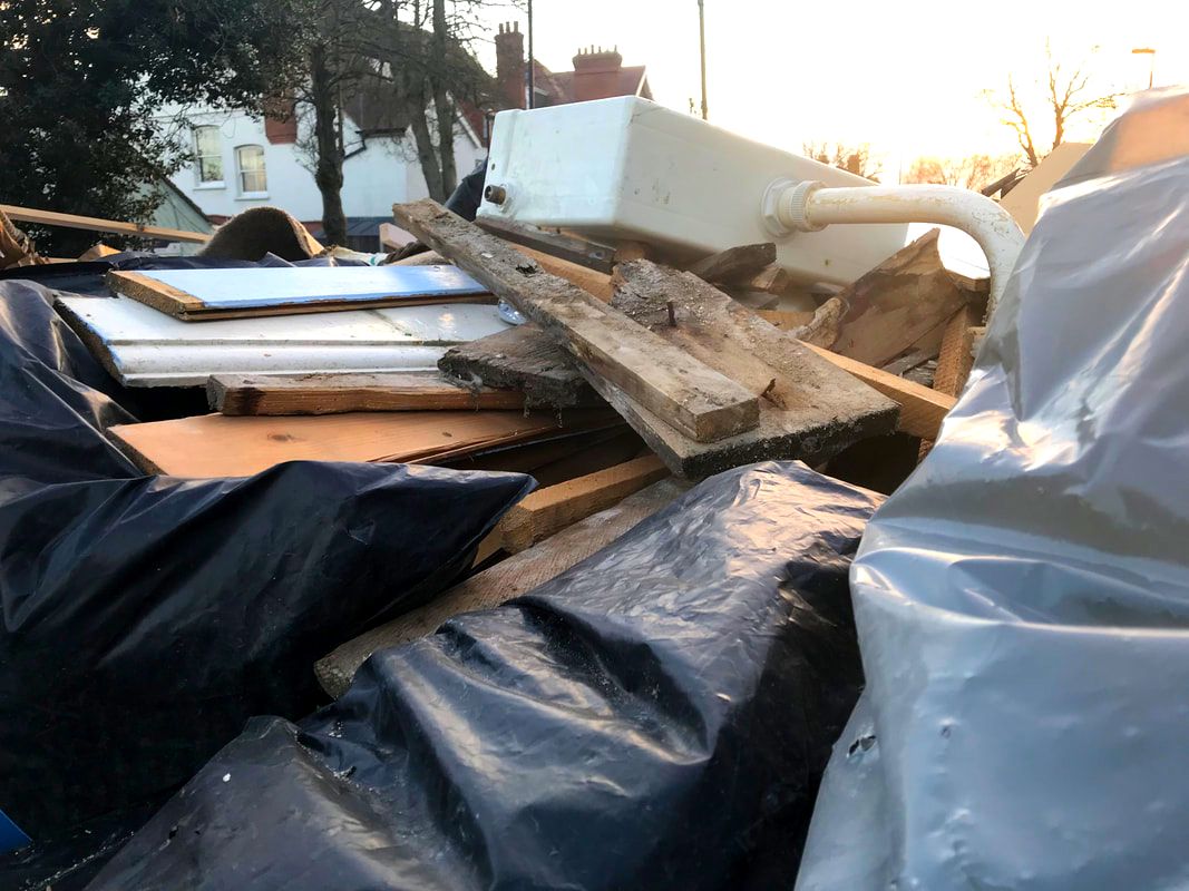
The Bad
These include some unattractive browns and misplaced trash.
|
|
|
|
|
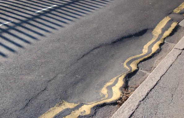
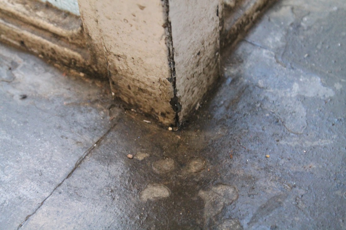
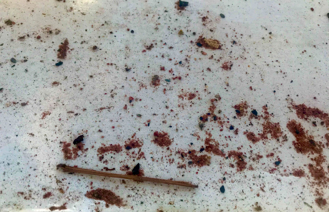
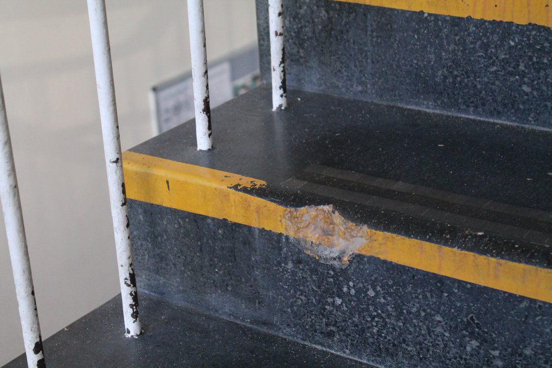
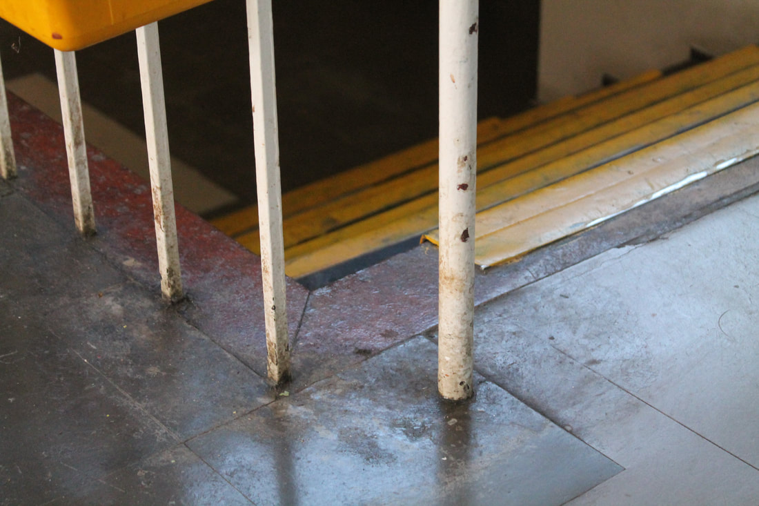
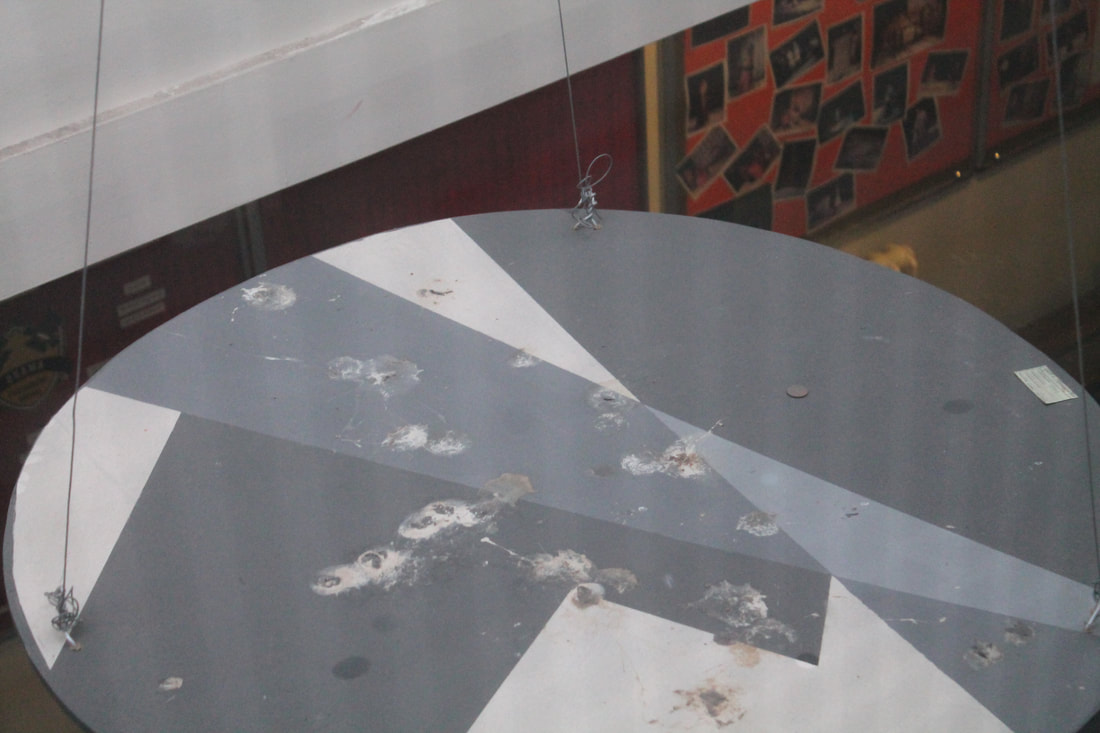
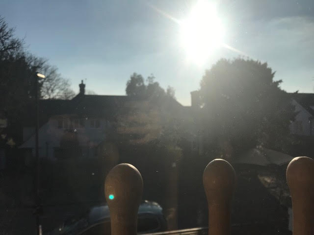
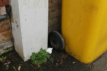
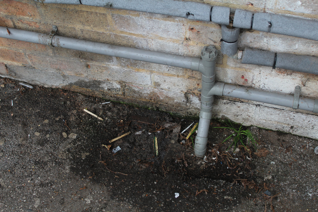
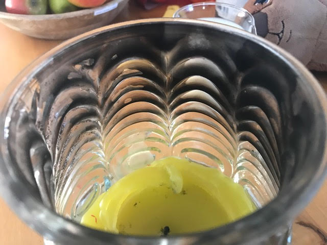
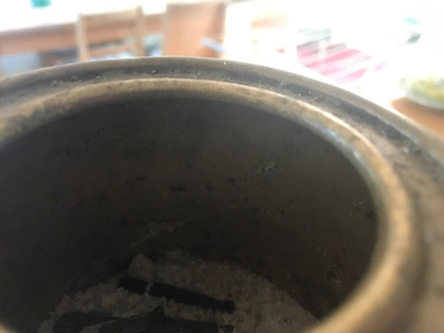
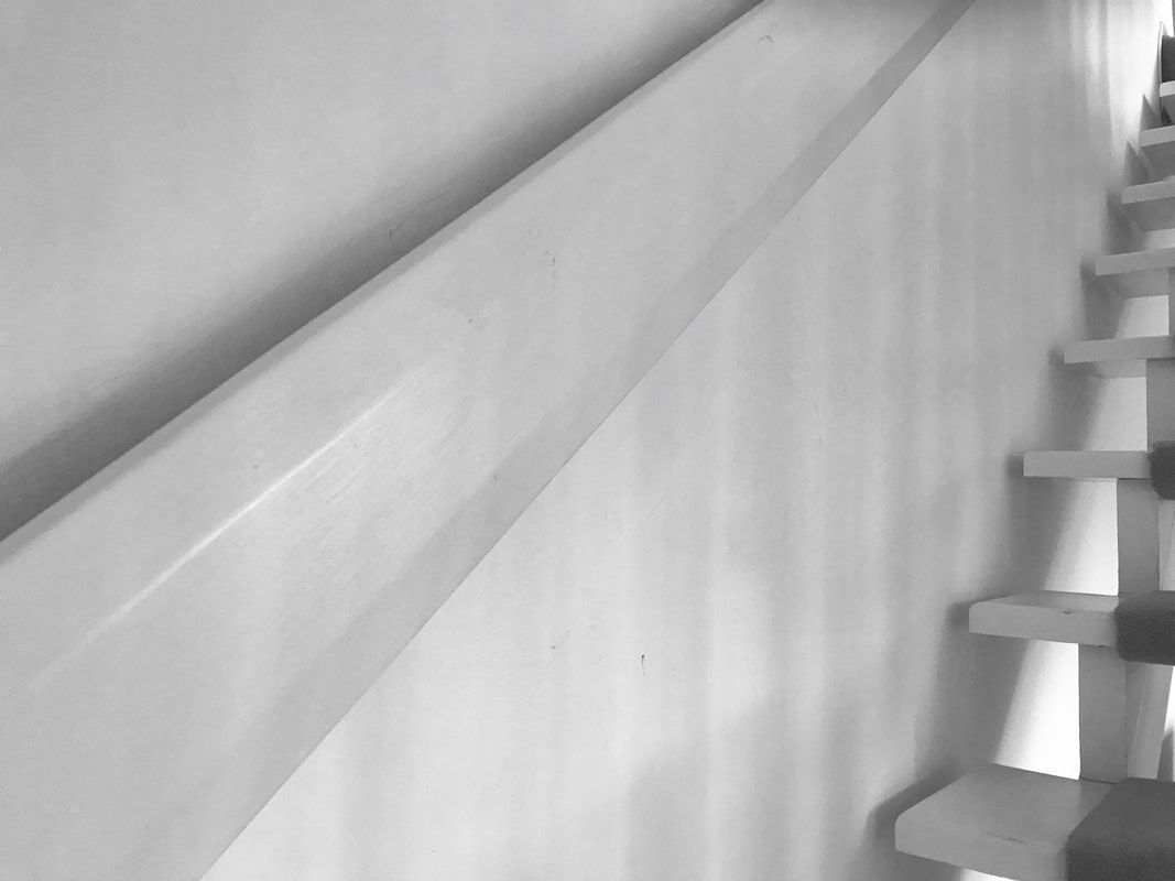
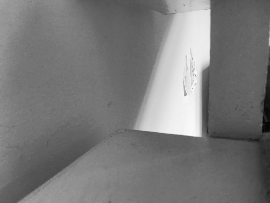
The Ugly
These ugly pictures include imperfections and bird faeces.
|
|
|
|
|
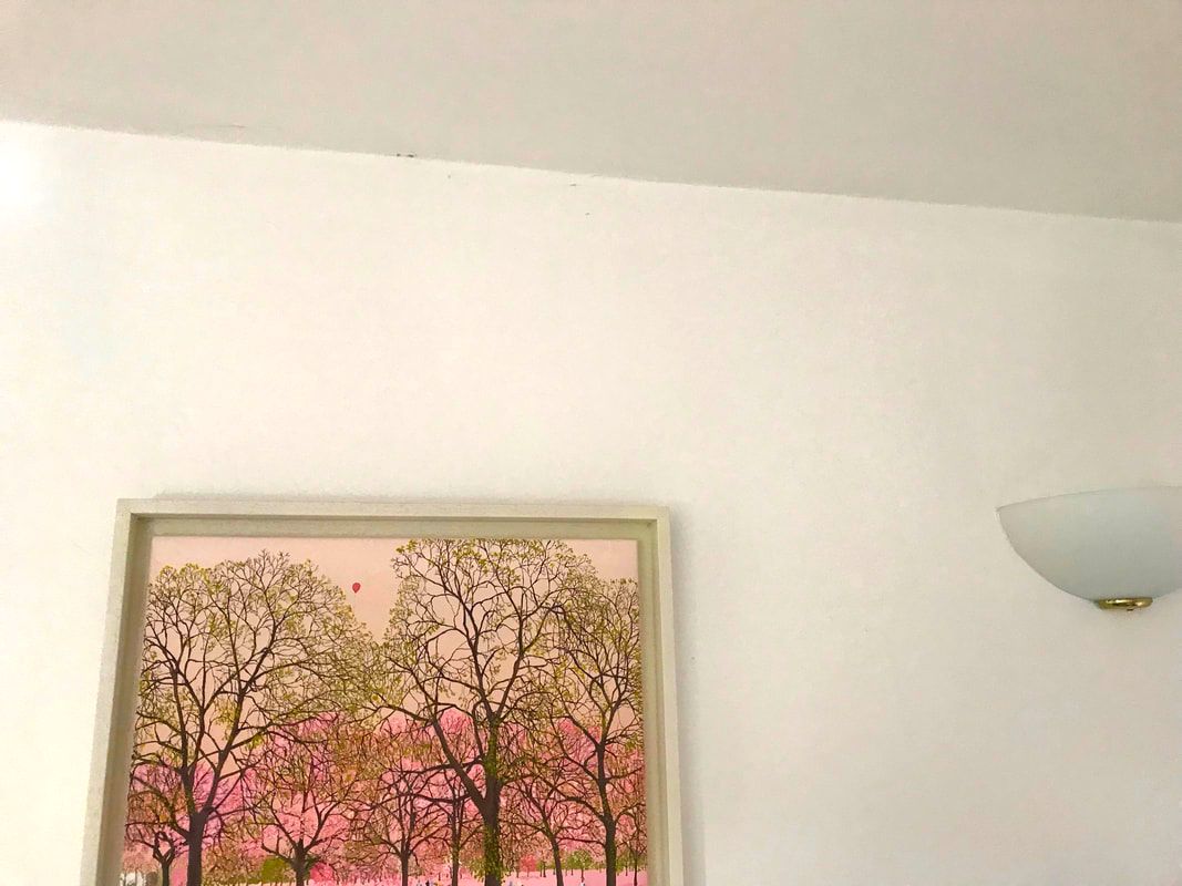
Home Response
|
Good
|
Bad
|
Ugly
|
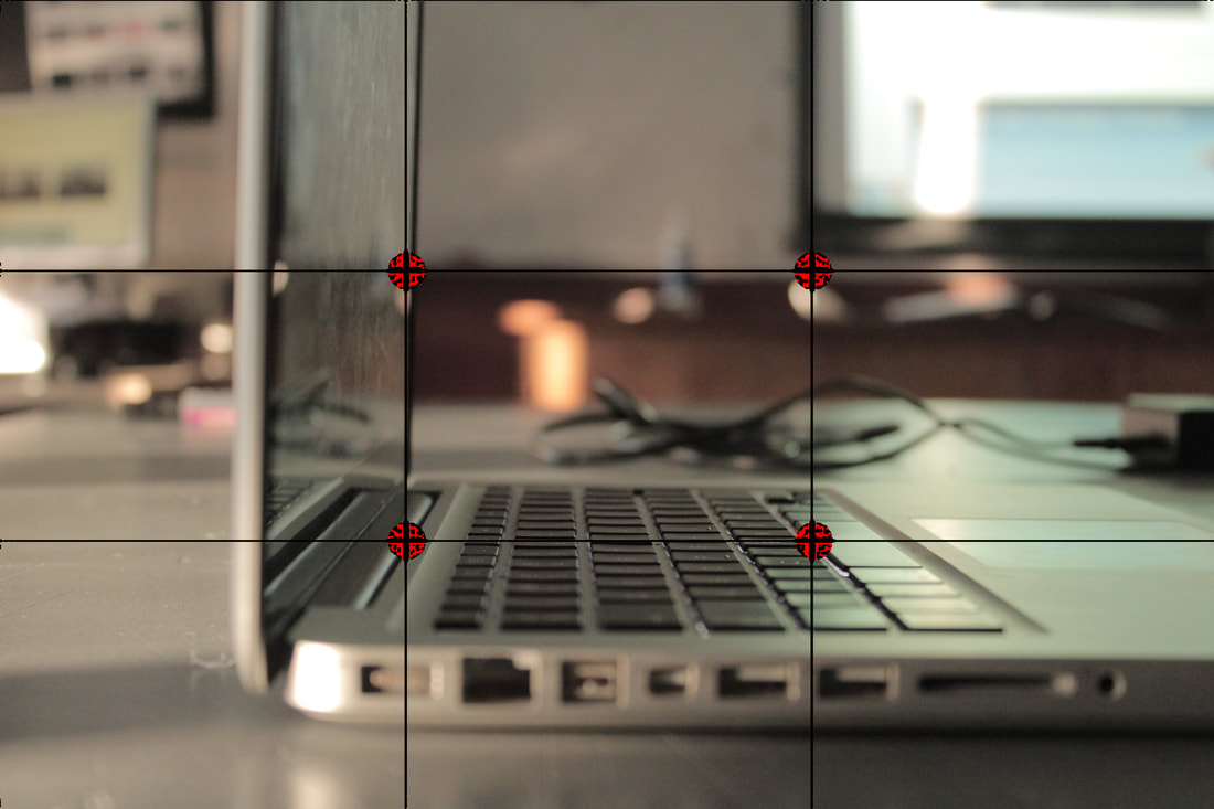
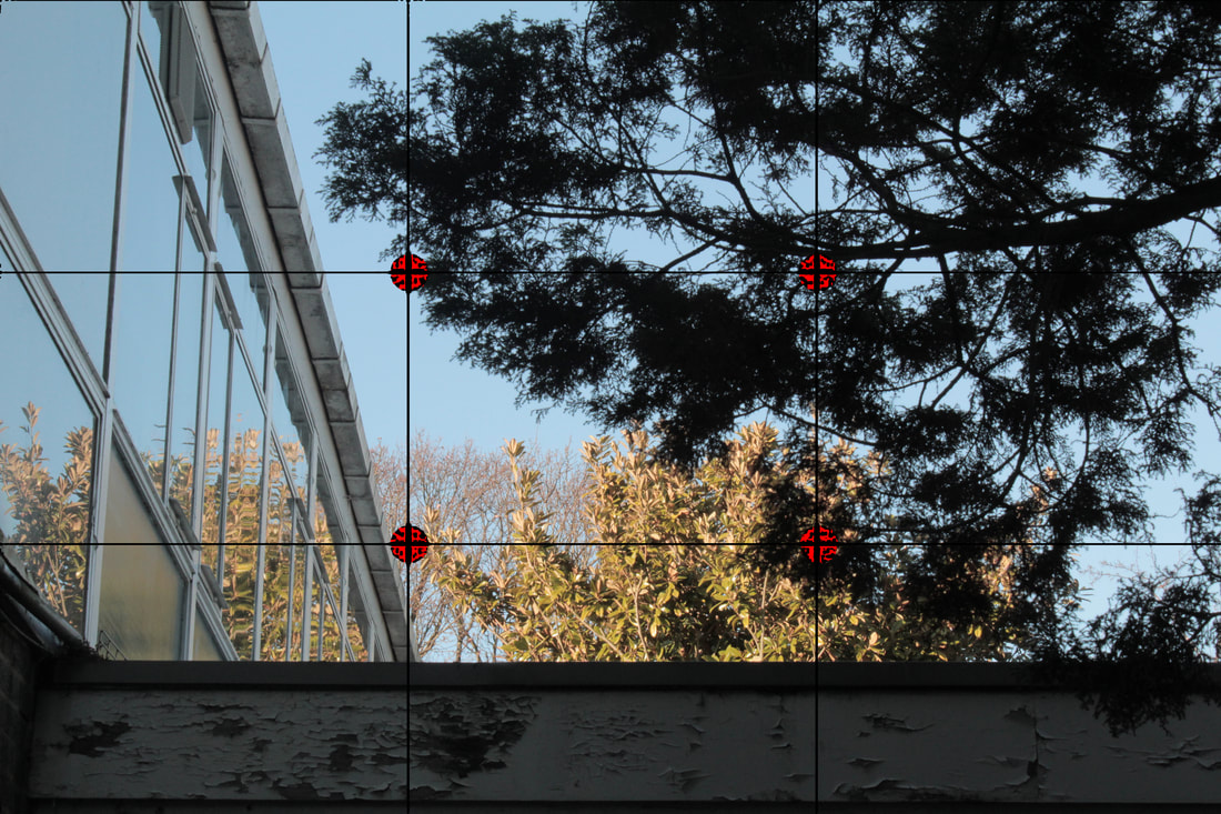
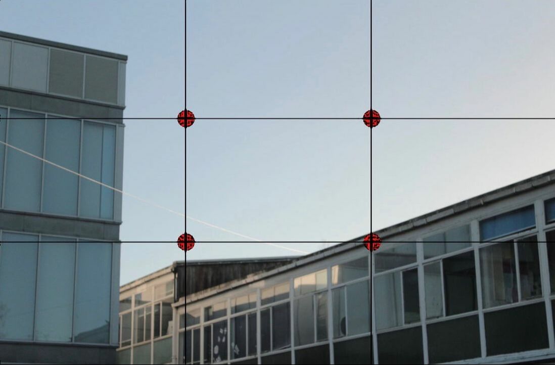
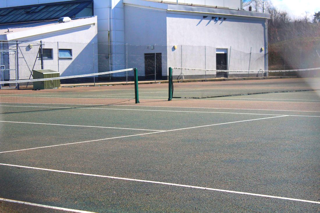
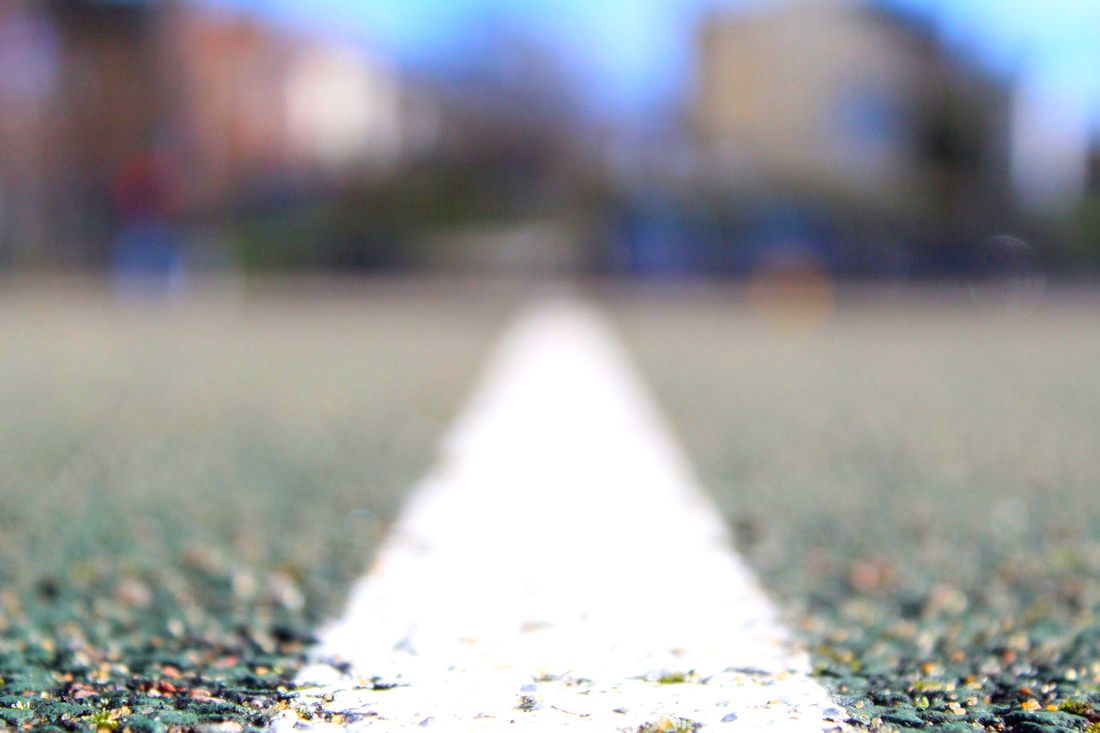
Rule of Thirds
The rule of thirds is a "rule of thumb" or guideline which applies to the process of composing visual images such as designs, films, paintings, and photographs. The guideline proposes that an image should be imagined as divided into nine equal parts by two equally spaced horizontal lines and two equally spaced vertical lines, and that important compositional elements should be placed along these lines or their intersections. Components of the technique claim that aligning a subject with these points creates more tension, energy and interest in the composition than simply centring the subject.
|
|
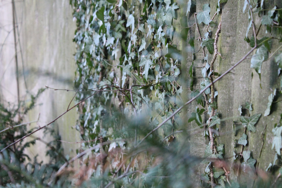
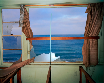
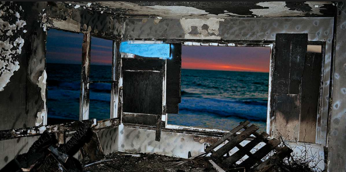
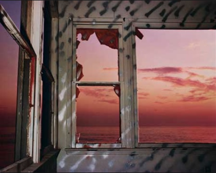
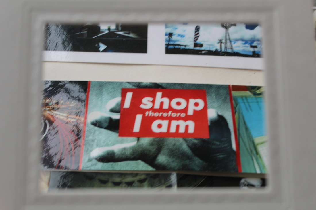
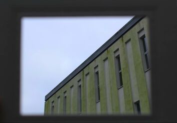
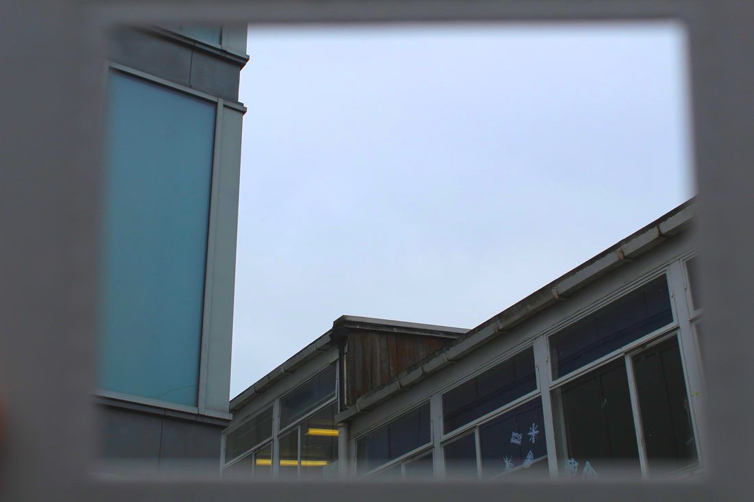
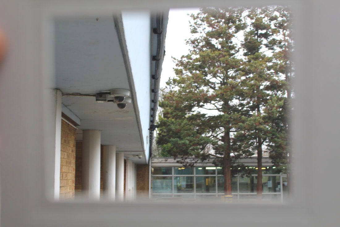
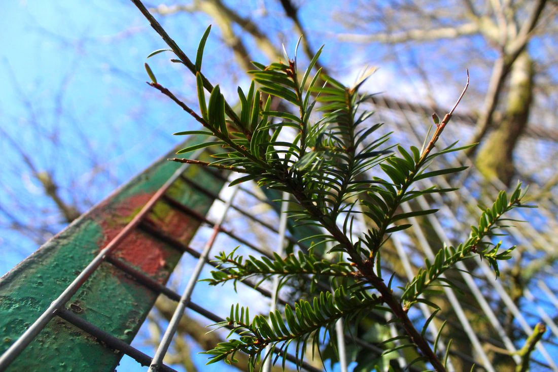
Framing
John Divola is the source photographer for this segment of work. He puts certain things in the foreground to create a frame for the image. This gives two things to focus on in the image and creates complexity, it gives the effect of the photo being reality.
|
|
|
First Response
|
|
|
Close up and far away
Here we took two different photos, of the same thing but with a different subject within the bigger picture. The colours in these are especially vibrant and it's fun to see the bigger picture before stepping into a closer viewpoint perhaps at a different angle. My favourite are the top left image in the top row and the far right image in the second row; I like their sharpness and vibrancy.
First Response

|
|

|
|
Far
|
Close
|
Far
|
Close
|
|
|
|
|
