Force
Using Pinterest, I complied a set of pictures to show the effect of force on the environment and on people. the illusions created are especially interesting as they make you stop and think how it was possible.
Force of Nature
Artist
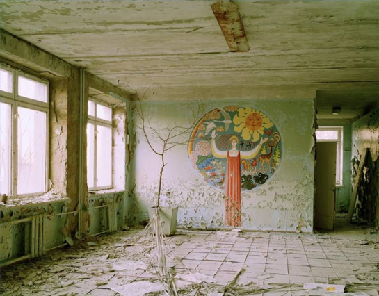
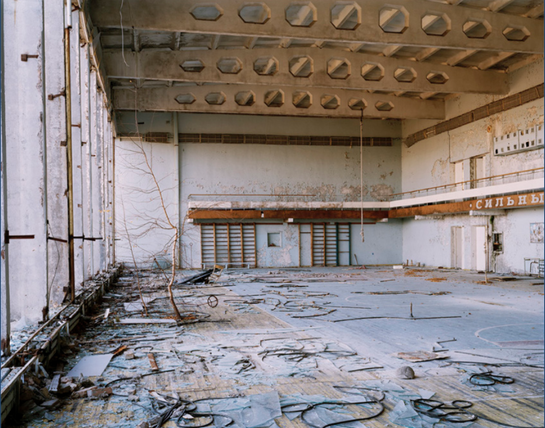
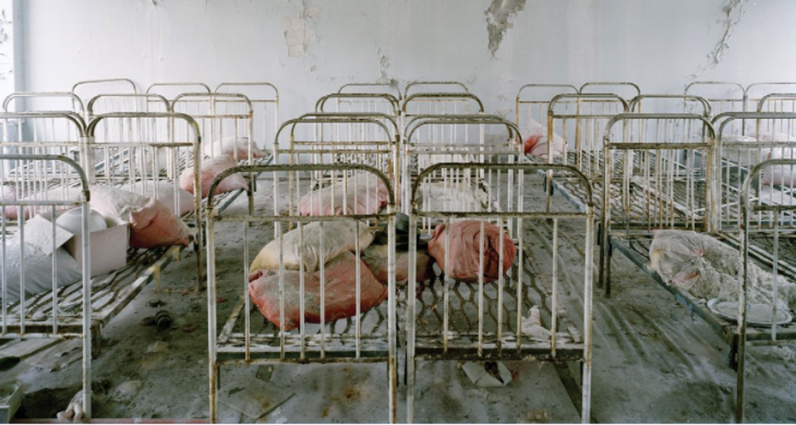
Nadav Kander - Half Life
Reactor No.4 at Chernobyl’s Nuclear Power Station exploded in 1986 leaving the surrounding area uninhabitable for many hundreds of years to come. It happened to be the 20th Anniversary since the explosion when he gained access as an artist to visit Chernobyl, photographing the deserted spaces in what was once a model Soviet City. Home to more than 40,000 people, the apartments, schools and hospitals that were hastily left following the controversial evacuation are stark reminders of past lives, leaving a disturbing sense of quiet, an uneasiness. There is a great beauty in a very real way to be found as the poignancy of human suffering almost hangs in the air.
|
|
First Response
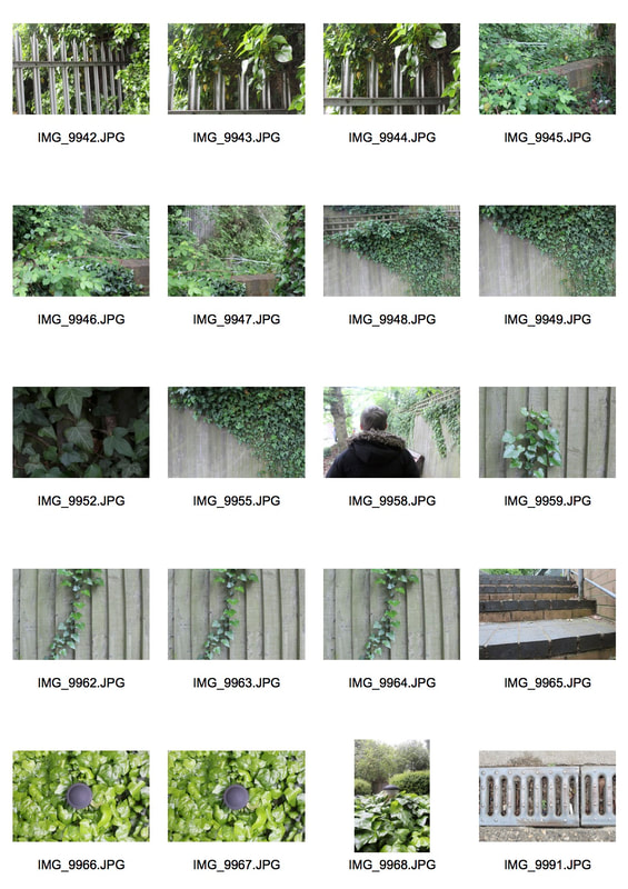
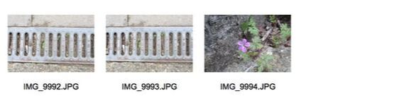
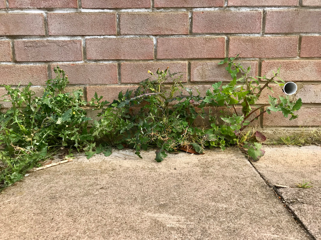
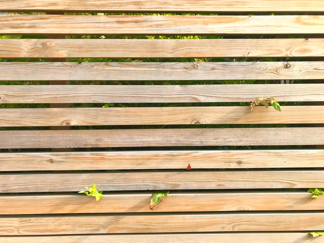
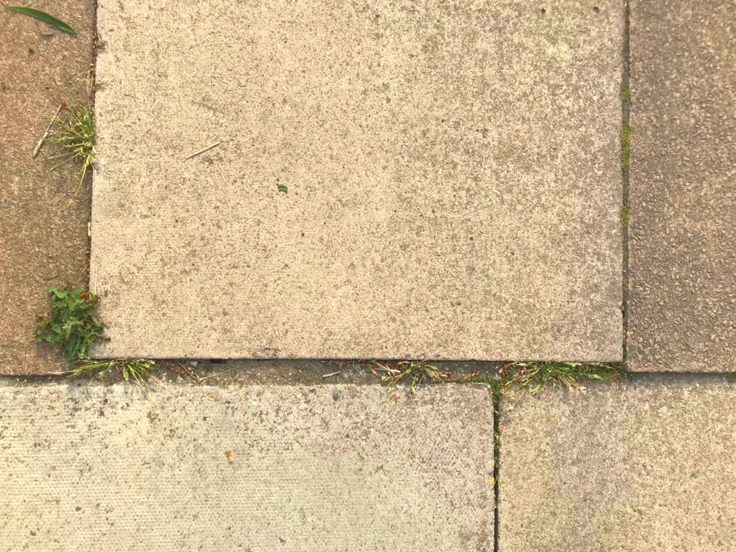
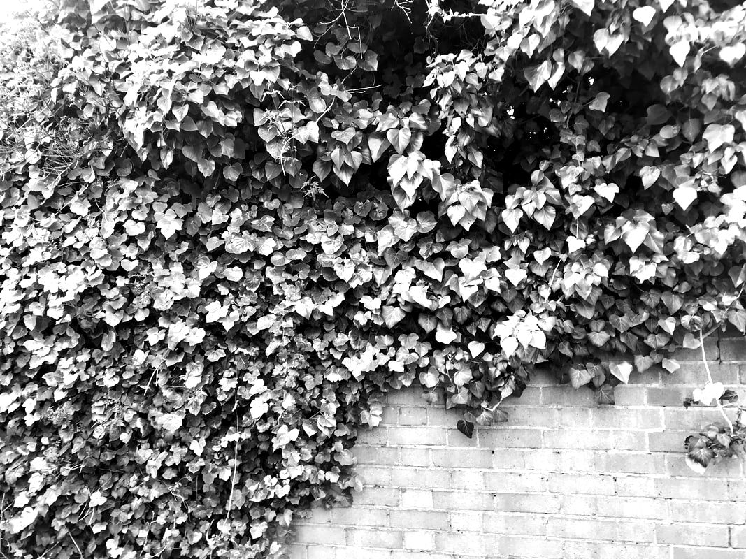
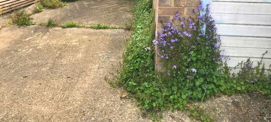
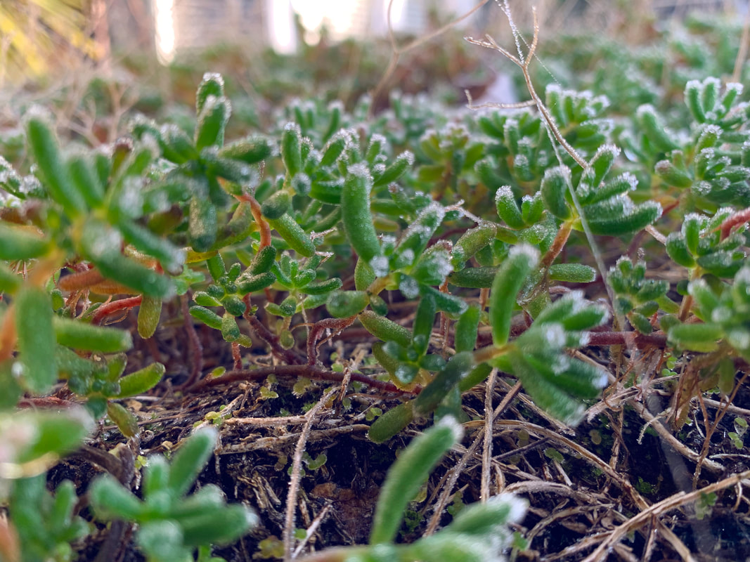
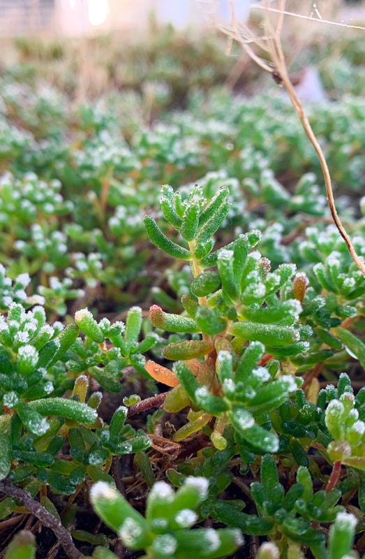
This project, Force of Nature, is to show the force of nature on the environment and how it shapes what we see. I made sure to include contrasts such as the first three images where the bright green leaves of the bush start to grow over the fence. Some of the images show the wildlife and greenery slowly creeping over the fence and growing through the cracks in the paving. The images show the slow unrelenting force of nature.
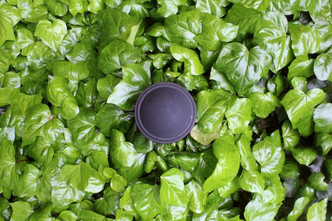
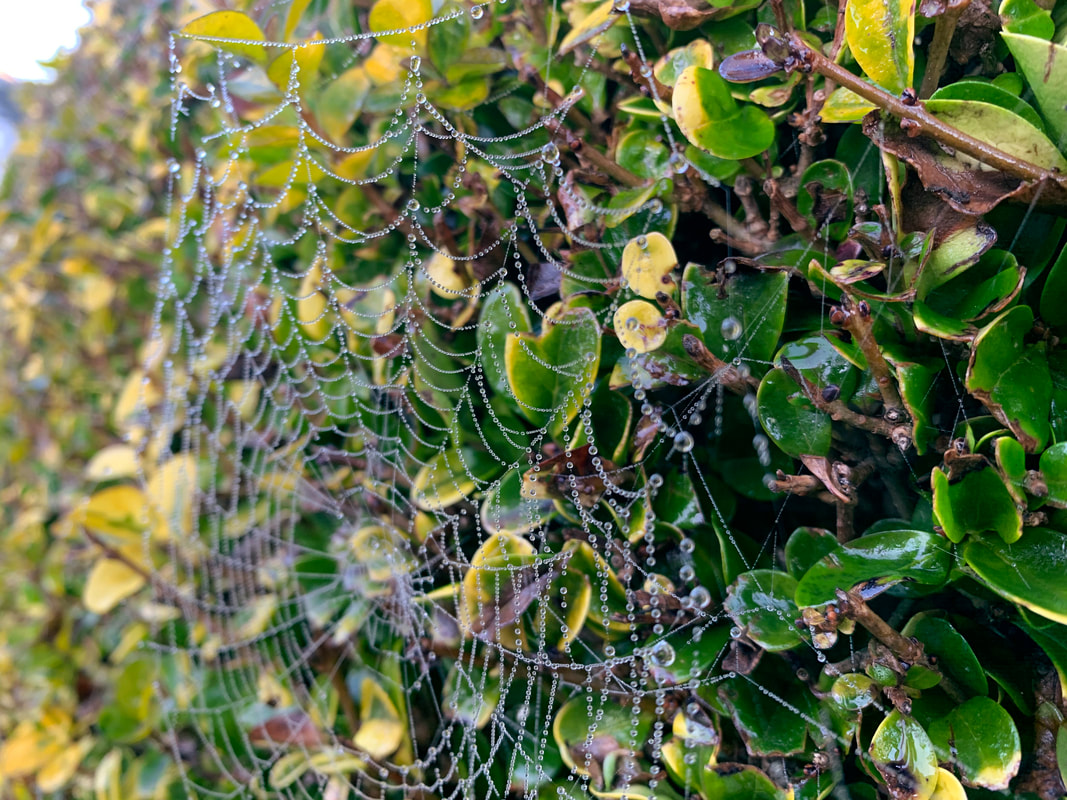
This one of my final pieces, and my favourite. The colour and vibrance is stunning and highlighted after editing; the leaves shine in the light.
WWW: capturing the force of nature
EBI: color
Formal Element
EBI: color
Formal Element
Home Response
The images below are an attempt to take the ideas of the force of nature and portray them in my natural environment.
|
|
|
|
|
Home Response - 2
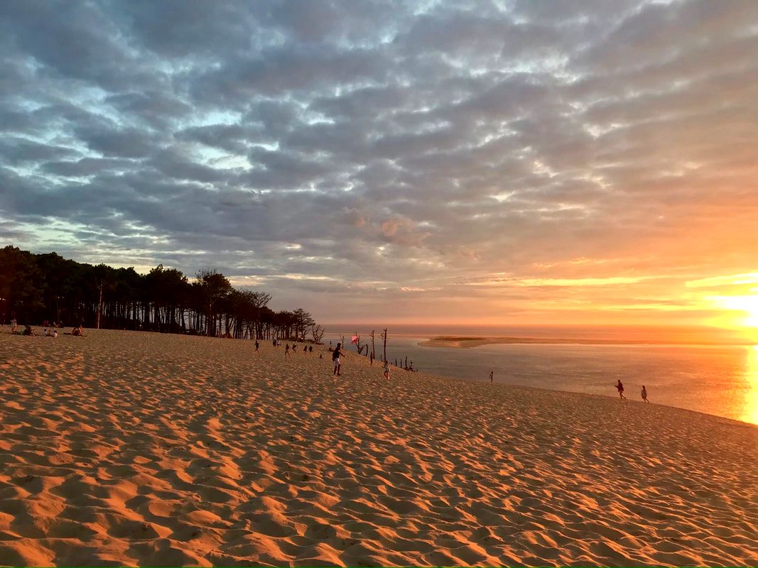
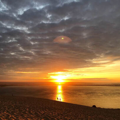
During my stay at The Great Dune of Pilat, I have taken some photos that show the sheer scale and beauty of the nature reserve.
The pictures were taken in 4K at the top of the dune on an iPhone.
The pictures were taken in 4K at the top of the dune on an iPhone.
|
|
After putting these images through editing, I've made sure that the blues in the sky come out through the clouds' edges and the sun has a pivotal part in the scene using reflection and contrast.
|
|
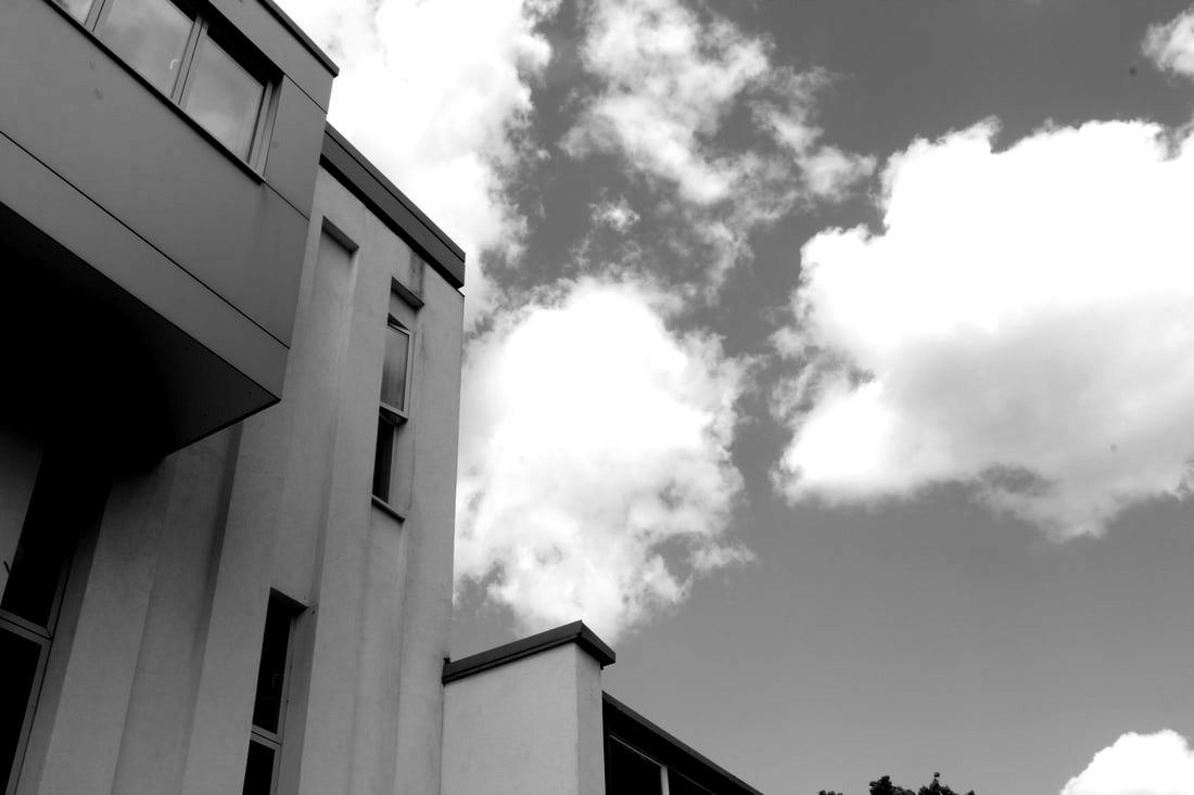
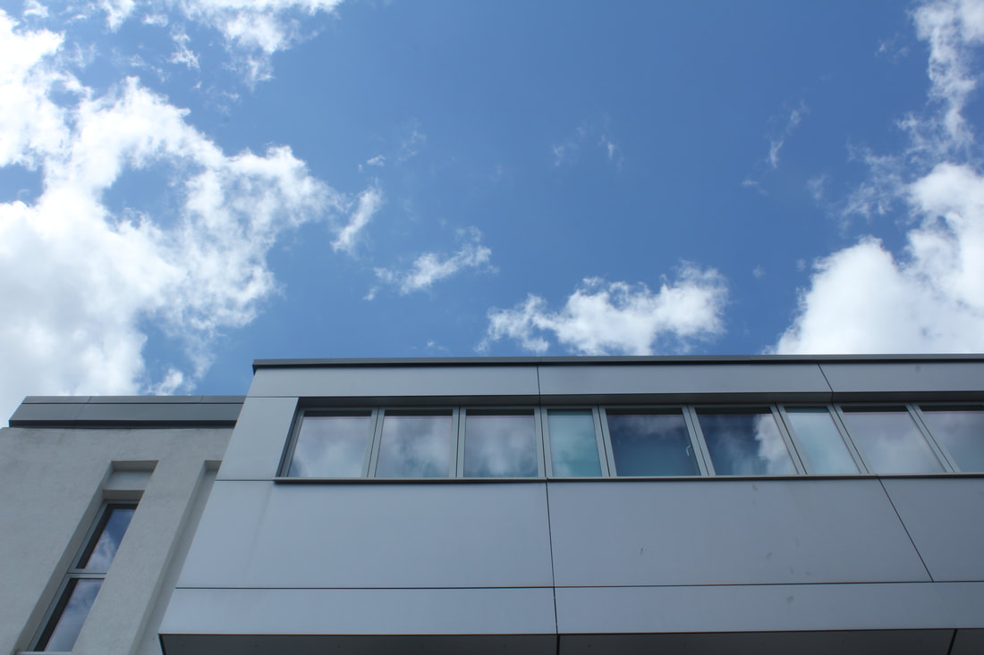
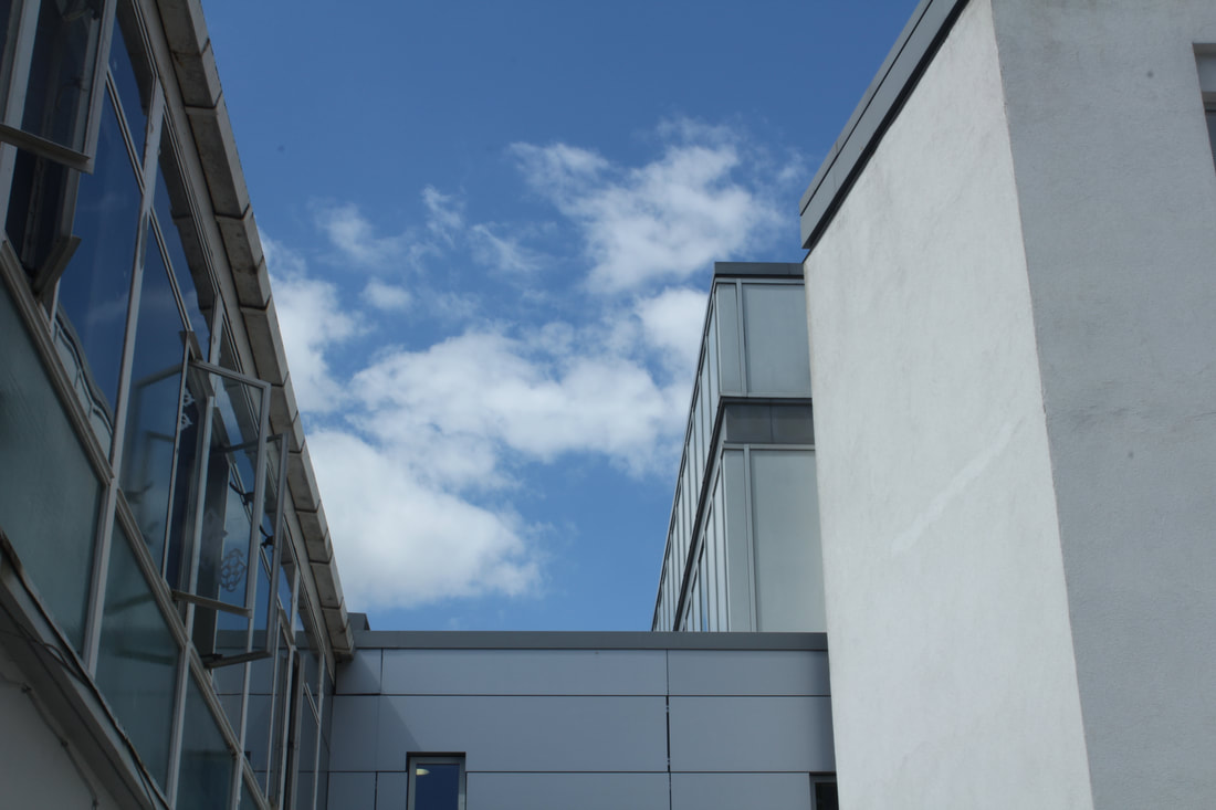
Force of Architecture
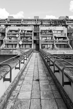
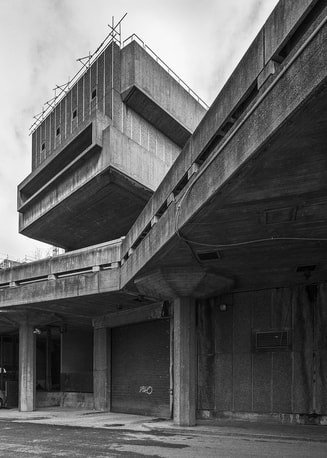
Simon Phipps is the link artist in this Force section. He follows the post-modernist and brutalist styles of British architecture, these describe the geometry of the architecture with blank concrete and sharp shapes like square roofs and bold angles. He showcases it to the public through the photographic medium, he utilises black and white to centre the focus on the architecture.
|
|
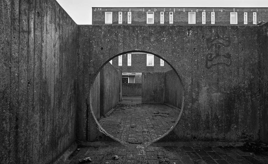
In the Force of Architecture, I used multiple techniques to create the feeling that buildings are large and unused, that they are almost abandoned with no emotion. What makes this effect even bolder is the black and white addition to two of the pictures, it also strengthens the power of negative space captured in the photographs.
|
|
|
|
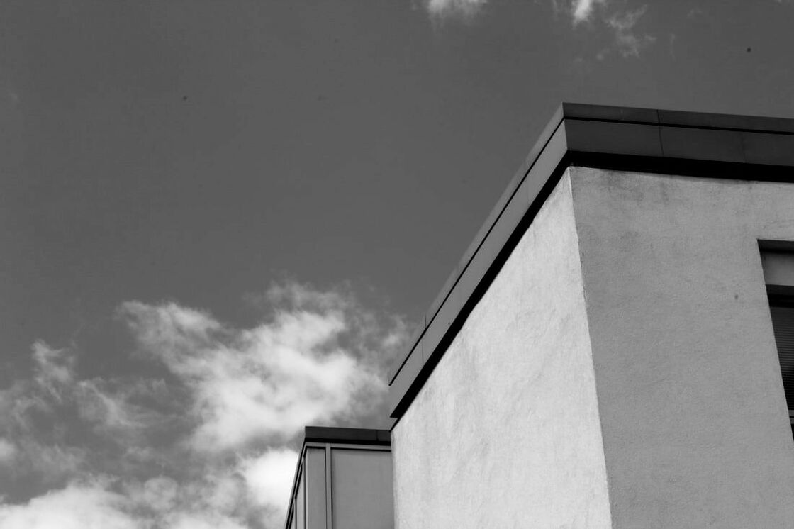
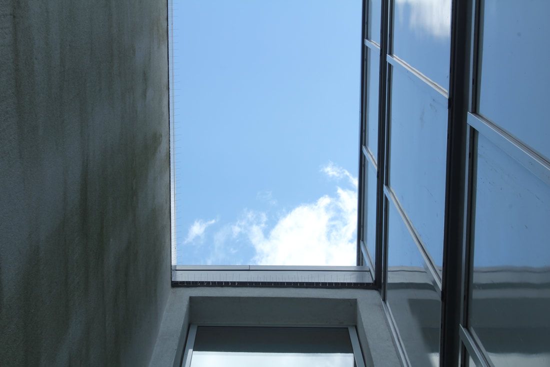
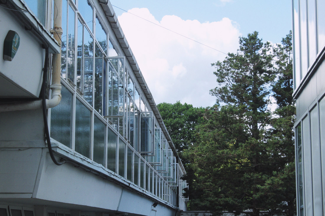
In some of these pictures I have not converted them to black and white as I have taken inspiration from the original artist and transferred his ideas to my own pieces.
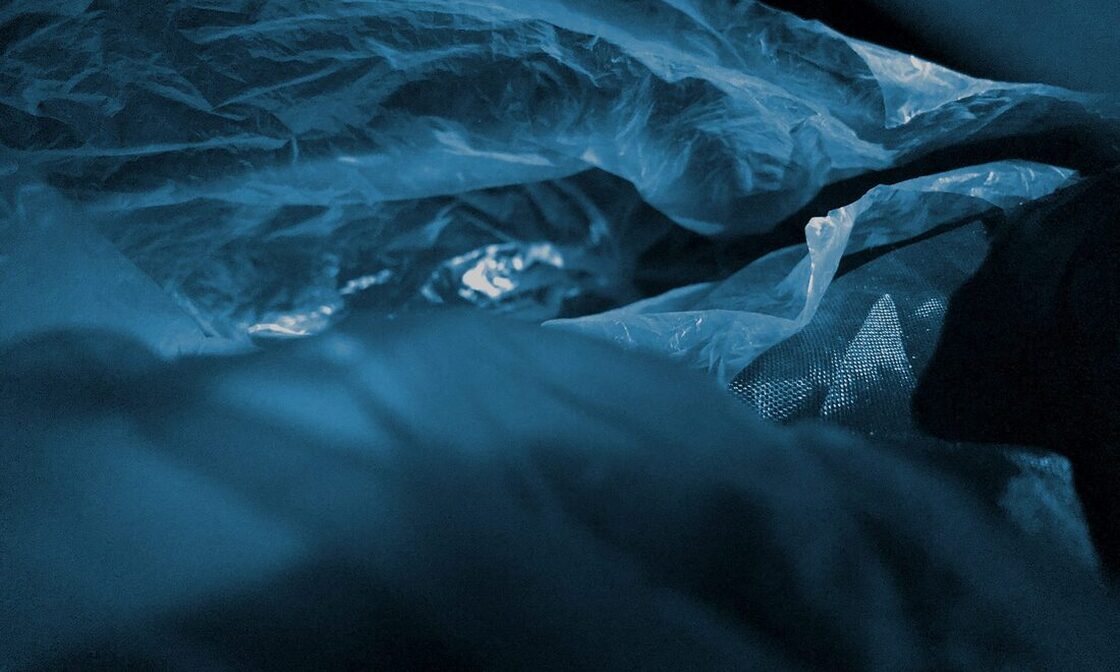
Applied Force
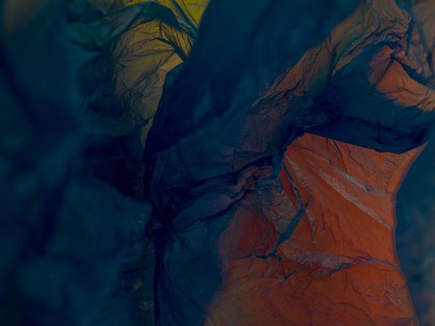
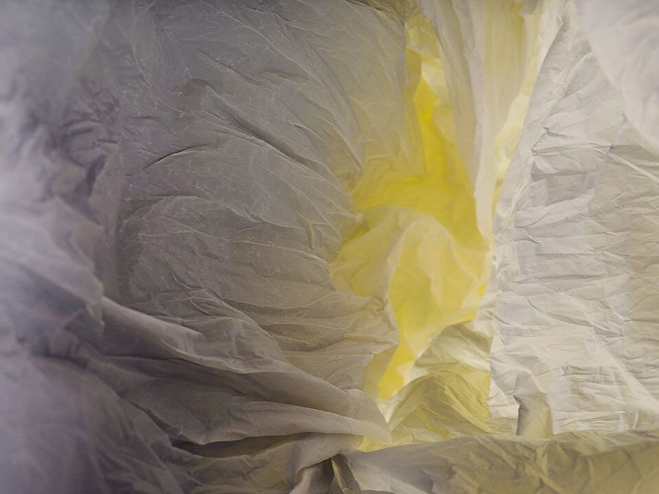
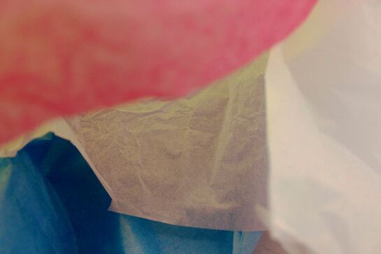
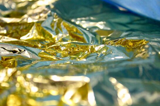
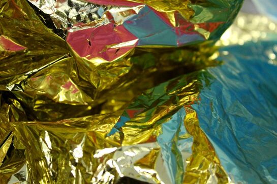
Francois Delfosse is a Belgian artist. Delfosse says that his images, which are representing air, where taken in a “glacier cave just North of the South Pole”, then he added that they were “viewed from the inside of a plastic bag”.
|
|
In Applied Force, I had to use mediums where the force on them seems to have a scale that was small and incredibly big at the same time, where you can't tell that the manipulations of the medium were in a small area or the scale was of extreme magnitude, with tunnels and epic caves. With the photos using the black mediums, the light is reflected and ricocheted creating a space-like effect.
|
|
|

|
A flaw in my work is that the edges of the materials that I've used are visible, making the image less likely to resemble a realistic environment.
|
|
The pink contrasting with the blue and gold not only complements the different elements of the photograph and adds a complex nature and feeling.
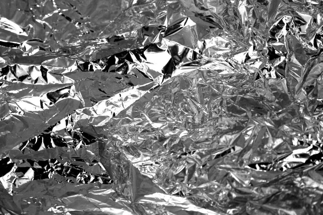
The black and white makes you focus on the special geometry in the photo and the range of whites and shines.
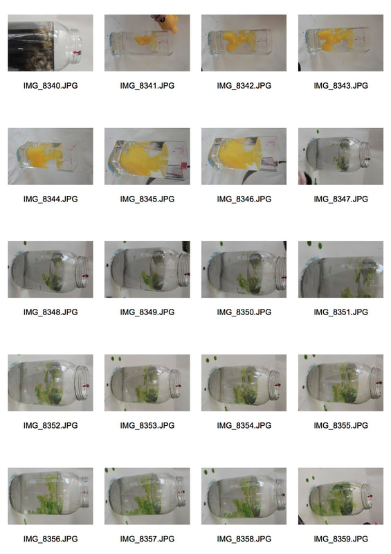
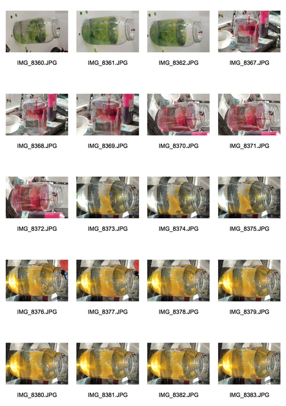
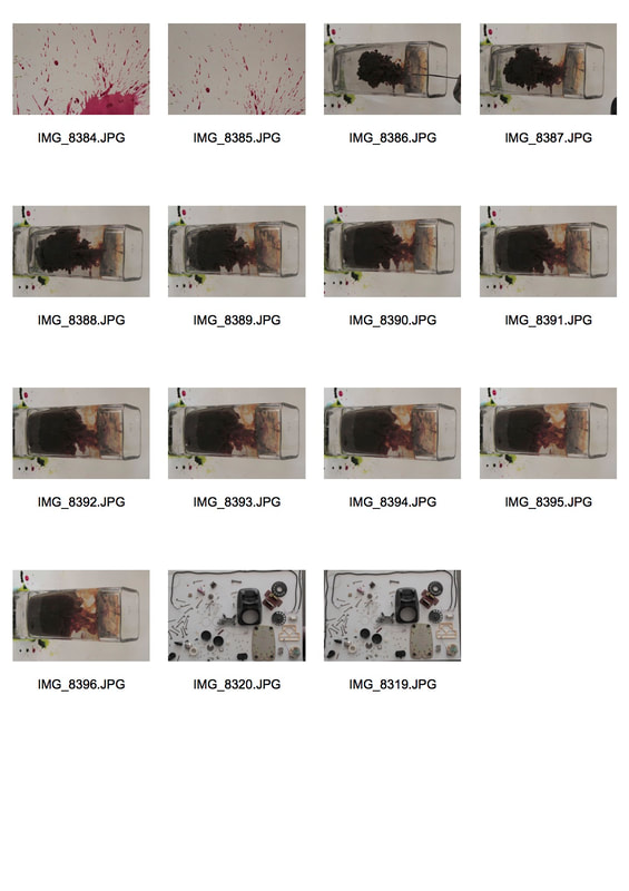
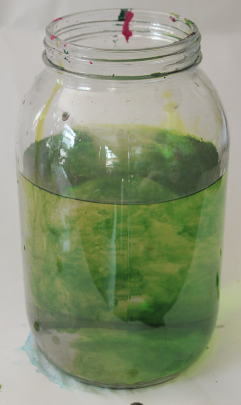
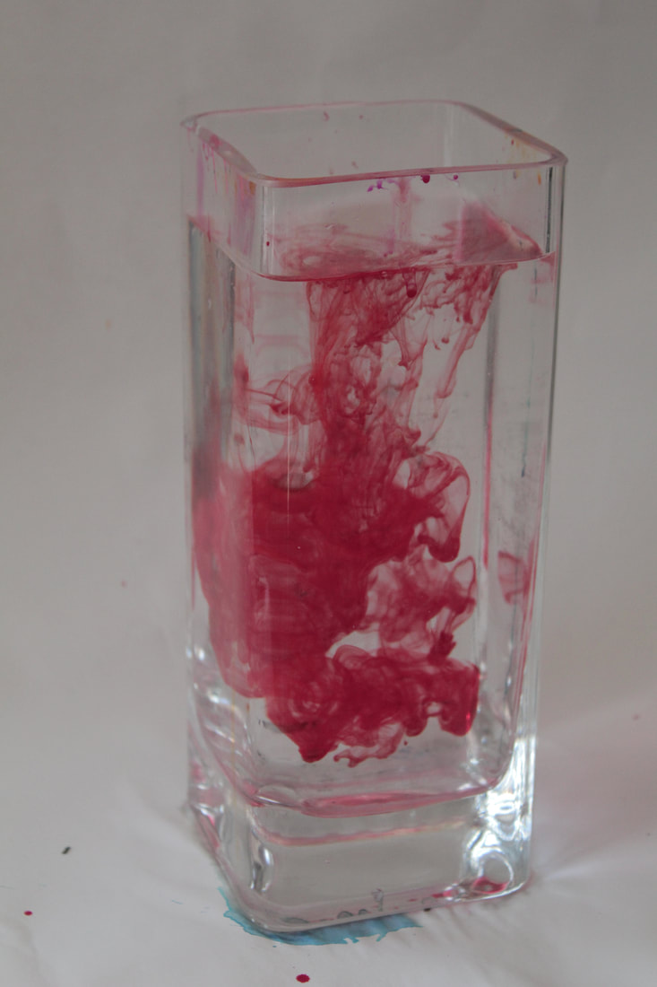
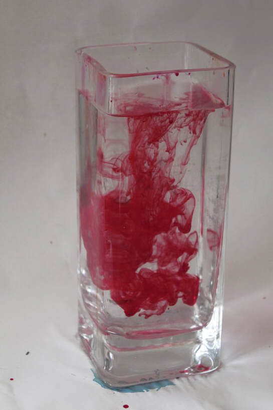
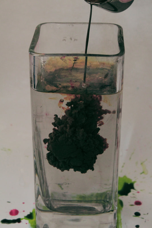
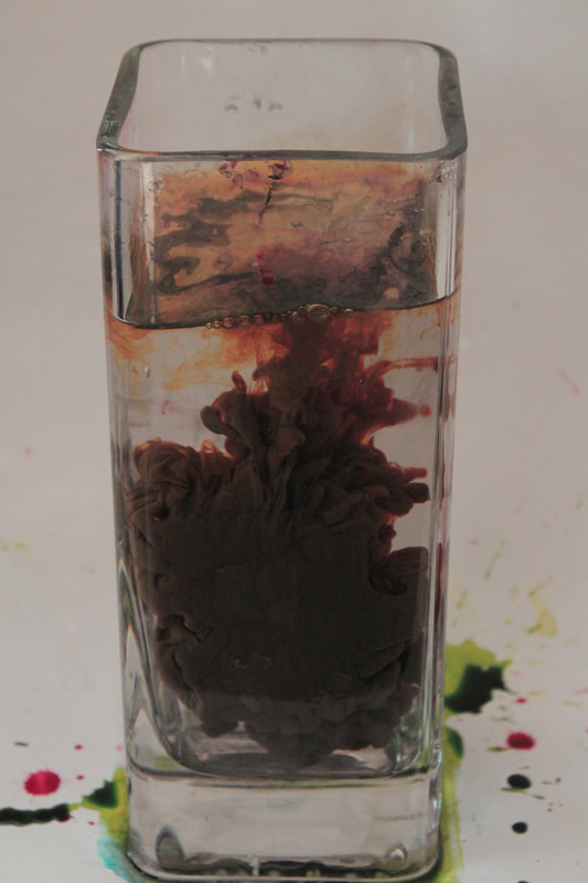
First Strand - Ink in Water
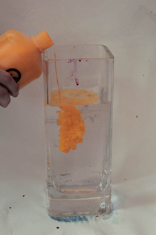
Here, as my first strand, I've chosen to photograph ink in water. I included all the pictures I took in the contact sheets below. I used black, green, yellow, and red ink. The ink creates this cloud as it slowly descends into the water and after editing, can look almost cartoonish.
|
|
|
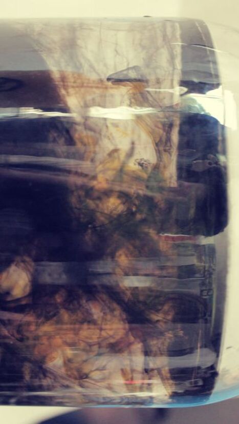
Here I have a vertical orientation of a jug of water with black ink. As the ink becomes more and more diluted by the water, the colour turns to a brown hue, and has a green tinted effect. I like it become it has an alien-like feel to it.
|
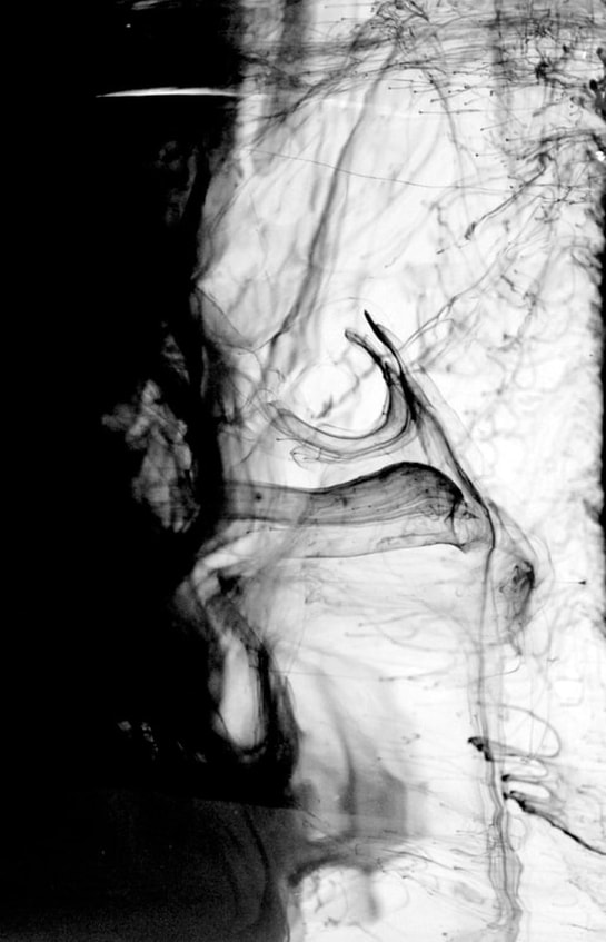
This is a similar black and white version of the photo to the left, with the diluted strands of the ink more defined. The particles slowly spread giving the ink a sheath over the water. I like it because of the firm contrast of black and white and how the black is slowly invading the white.
|
|

|
Here is the before and after between two of the same image. The left, the before: is the raw image with a natural organic yellow, like a flowery yellow.
On the right is the image after editing, which has a bold border to the cloud of ink adding the cartoonish feel, and after isolation the shade of yellow, I changed it to a deeper yellow.
On the right is the image after editing, which has a bold border to the cloud of ink adding the cartoonish feel, and after isolation the shade of yellow, I changed it to a deeper yellow.
|
|
|
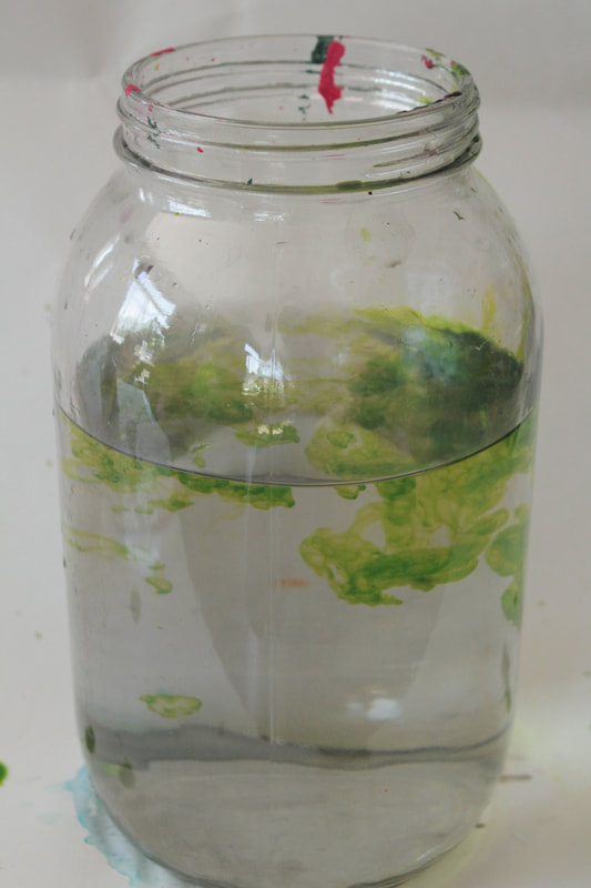
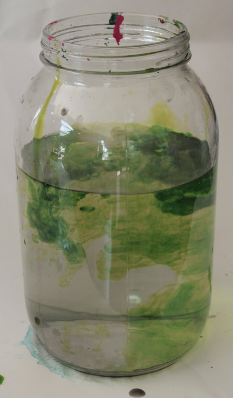
Here are three images of the same pour of green ink. From left to right, the ink has been left in the jar for longer, The defined strands and clouds of ink slowly spread through the water travelling down. The dilution and movement has a very natural pattern to it, with the clouds slowly sprawling downwards in their swirls and masking the original water in the earthy green.
|
|
Here the same image is also a before and after but of editing. The red was isolated and changed to a deeper more brown red, and in general the colours deepened to give character.
|
|
